Public Art Proposal Display

Minna-Natoma Art Corridor Project: Street Paving

In partnership with Public Works, the vision for this project is to transform Minna and Natoma Streets into a unique pedestrian destination by integrating a variety of artists’ designs into the streetscape paving pattern in concert with a series of sculptural street furniture elements such as seating, bollards and bicycle racks. With the underlying belief that artists bring a unique and original perspective to design, the Minna-Natoma Art Corridor is a synergistic collaboration, taking advantage of needed streetscape improvements and the expertise and talent of artists to beautify and energize the alleyways.  
 
PROJECT GOALS
● Create a new visual identity for Natoma and Minna Streets through artist involvement in the design of the streetscape, including paving, lighting, landscaping, and wayfinding. 
● Make the Minna-Natoma corridor a “hidden gem” pedestrian destination that pulls people to and from the Transbay Terminal and Yerba Buena Gardens and SFMOMA, and through the passageway between Howard and Natoma Streets, adjacent to SFMOMA. 
● Engage artists of local, national, and international renown to create projects that respond to site-specific needs and opportunities.
● Prioritize diversity among artists, elevating typically underrepresented voices in public art projects.
● Maintain visual cohesion within the neighborhood with seamless integration of art into streetscape improvements and the surrounding context.
● Support the various goals, policies, and implementation strategies articulated in:
● The South Downtown Design and Activation Plan
● Transit Center District Plan 
● SFMOMA Expansion Plan 
● YBCBD Street Life Plan
 
PROJECT SITE
Minna Street from the Salesforce Transit Center to Third Street
Natoma Street from the Salesforce Transit Center to SFMOMA 
Located within the SOMA Pilipinas Cultural District.  
 
BACKGROUND
The Arts Commission conducted a public competition resulting in the selection of 13 finalists who were invited to develop an original design proposal for one of the two project categories of either street paving design or sculptural street furniture.  There are five finalists for the sculptural street furniture and eight finalists for the street paving. Of the 13 finalists, five artists will be awarded commissions to develop unique designs for the paving and sculptural street furniture. 
 
Public Works will integrate the artists’ designs in their construction documents for Minna-Natoma Art Corridor, which will be publicly bid and built or fabricated by a general contractor. The five artists will work closely with the Arts Commission and Public Works to further develop their designs, review the selection of materials to be used in the implementation of their project and to inspect and approve actual mock ups and the finished construction. 
 
The proposals submitted by the 13 finalists are presented here for your public comment. The Arts Commission will share the public comments with the Minna Natoma Selection Panel prior to their deliberations and review of the proposals. The Arts Commission will review the Minna Natoma Selection Panel’s recommendations and will make the final determination as to the five artists to be commissioned for these two project categories. 
 
PARTNERS
The Minna-Natoma Art Corridor project brings together a diverse team of stakeholders to transform Minna and Natoma Streets into a pedestrian destination that combines infrastructural upgrades and public art interventions.
This project is a partnership between the City, the San Francisco Museum of Modern Art (SFMOMA) and the Yerba Buena Community Benefit District (YBCBD). City departments include San Francisco Public Works (Public Works), the San Francisco Municipal Transportation Agency (SFMTA), the San Francisco Arts Commission (SFAC), and the San Francisco Planning Department (Planning). 

Untitled

Spencer Keeton Cunningham

Spencer Keeton Cunningham_new.jpg
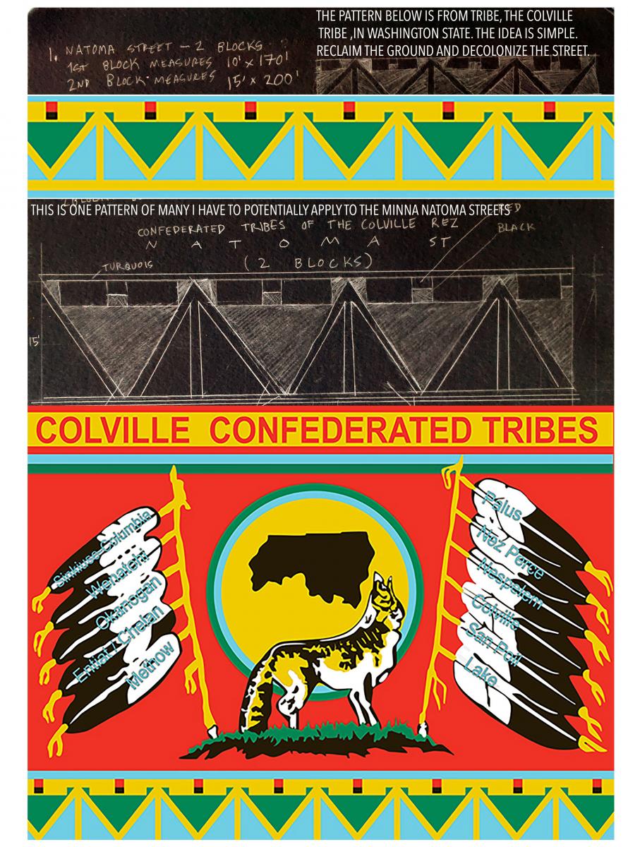
My goal with this project is to bring lndigenous voices to light and bring contemporary Indigenous art to the forefront in the SF Bay area. San Francisco is Oh lone, Miwok, & Coast Miwok territory. It is only right that we mark the grounds with an indigenous design & have a Indigenous event as an opening ceremony for the art placed on the ground.  I am connected to the lndignenous community that still resides in SF and the bay. Most of us have been pushed out historically and in recent years. If I am selected I would like to urge the city to make an effort to include more Indigenous voices in the city planning of art projects.
 
I have lived in the SF area since 2004. I co-founded the Indigenous Arts Coalition in SF in 2008.1 graduated from SFAI in 2010. John Roloff has a sculpture right down the street from where this project is happenening. He was a mentor of mine at SFAI. I have been exhibiting in museums and galleries for the past 18 years. I has exhibited at the Wenying Highland Art Museum in China, The Crocker Museum, The Autry Museum in Los Angeles, which the current exhibit (WHEN I REMEMBER I SEE RED is still up until January 2022). I have also created public artworks in Hong Kong, Australia, Japan, New Zealand, Mexico,] New York, Oakland, Hawaii, Tasmania, Amsterdam, Miami, Alaska, Seattle, Toronto, & British Columbia. My painting work work can be found in the permanent collection of the Berkeley Art Museum have been inducted into the World Congress of Art History in Bejing China by Art Historian Elaine O'Brien.

This project proposal is simple. I want to bring patternwork from my people to this ground. This is a symbolic gesture. This is a very significant gesture to have an Indigenous artist mark the ground. San Francisco needs to invest in Indigenous voices. Now is the time. 

I want this project to be the beginning of something new in SF. I want to create a marking on the street that is simple and works with the application process  of the long lasting paint or plastic inlay on the street (industrial paint is fine) The inlay could be used as an accent on the crosswalks. The following imagery is all done by hand and pencil and ink on paper. I was informed that these were supposed to be initial designs. If selected I would be digitally creating designs to work with the people applying the industrial paint to the surface. I am ver y hands on artist but I would like this peice to be very permanent so I am ready to just design and let the proper team apply the paint. 

Each pattern you see in this proposal has a specific menaing. These patterns are sacred. I have also created contemporary versions of the patterns as potentional designs. I have inlcluded much more that one potential design here. Ther eare quite a few concepts and designs to choose from. 

I have worked on public art projects for the pas 18 years. I am ready to mark the ground of SF with a pattern and start to raise up Indigenous People in the community that need their voices to be heard. This mural will not be political or edgy or whatever it is that people label lndignous art for a cause. In other words there will be no use of commercial symbols (as pictured below) in the Minna Natoma project. This work will be strictly patternwork with a strong meaning and message. But a very postitive one and the application of the Indigenous marking to the ground is what makes it contemporary. I know that the art needs to be family friendly, PG, Safe for young people and people of all ages cultures etc. This mural will be positive, bright and incorporate Indigenous culture into its creation, application, and if selected the opening ceremony of the peice (where I mentioned I would like to have Indigenous community that I would like to hire using SFAC funds to come sing, drum, tell stories etc) I have done multiple projects with Indigenous youth in SF and I would like to have some youth be a part of this project somehow as well potentially.

View Spencer Keeton Cunningham's proposal

The Strength of Our Connection

Adia Millet

Adia Millett_Proposal Board_Natoma_Final.jpg
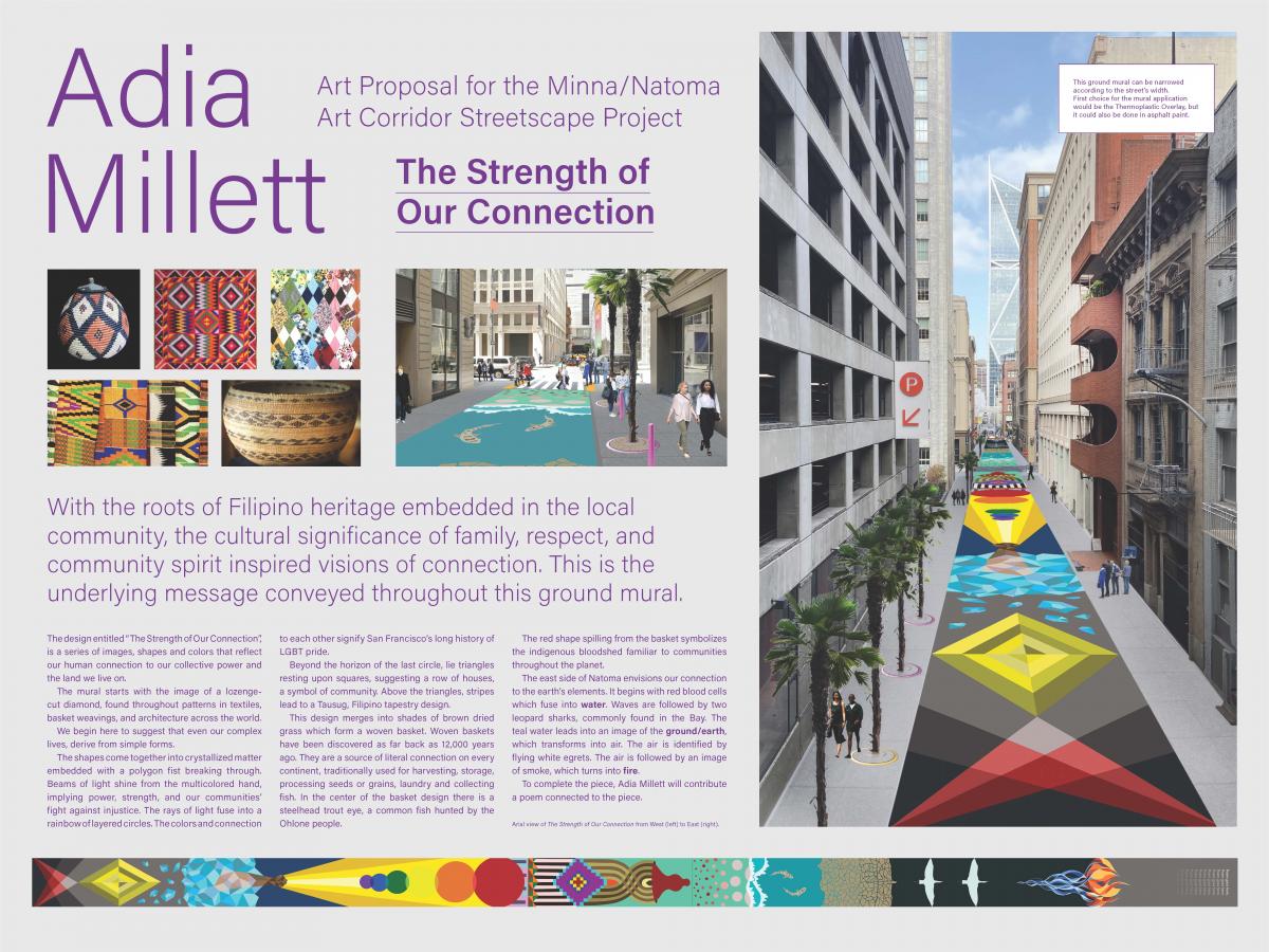
With the roots of Filipino heritage embedded in the local community, the cultural significance of family, respect, and community spirit inspired visions of connection. This is the underlying message conveyed throughout this ground mural.

The design entitled “The Strength of Our Connection”, is a series of images, shapes and colors that reflect our human connection to our collective power and the land we live on. The mural starts with the image of a lozenge cut diamond, found throughout patterns in textiles, basket weavings, and architecture across the world. We begin here to suggest that even our complex lives, derive from simple forms. The shapes come together into crystallized matter embedded with a polygon fist breaking through. Beams of light shine from the multicolored hand, implying power, strength, and our communities’ fight against injustice. The rays of light fuse into a rainbow of layered circles. The colors and connection to each other signify San Francisco’s long history of LGBT pride.

Beyond the horizon of the last circle, lie triangles resting upon squares, suggesting a row of houses, a symbol of community. Above the triangles, stripes lead to a Tausug tapestry design. The Filipino, Tausug people are well-known for tapestry weaving techniques found in their pis (head cloths), tadjung (tubular skirts), and kandit (sashes). The cloth surface of the pis siyabit is characterized by diamond shapes and diagonal crosses, inside small squares and rectangles.

This design merges into shades of brown dried grass which form a woven basket. Woven baskets have been discovered as far back as 12,000 years ago. They are a source of literal connection on every continent, traditionally used for harvesting, storage, processing seeds or grains, laundry and collecting fish. In the center of the basket design there is a steelhead trout eye, a common fish hunted by the Ohlone people.

The red shape spilling from the basket symbolizes the indigenous bloodshed familiar to communities throughout the planet. Note: At this point a line is marked for the crosswalk and street. The east side of Natoma envisions our connection to the earth’s elements. It begins with red blood cells which fuse into water. Waves are followed by two leopard sharks, commonly found in the Bay. The teal water leads into an image of the ground/earth, which transforms into air. The air is identified by flying white egrets. The air is followed by an image of smoke, which turns into fire. To complete the piece, Adia Millett will contribute a poem connected to the piece. (see below)

Note: This ground mural can be narrowed according to the street’s width.

First choice for the mural application would be the Thermoplastic Overlay, but it could also be done in asphalt paint.

Poem: The Strength of Our Connection

Remember…

There is no them, there is only us.
There is no one to follow,
no one to resist.

The network is offline.
The connection is in our eyes,
our hands, our voices and our hearts.

We are the children of bloodshed.

We are the earth beneath the concrete.
We are the air infused with fossil fuel.
We are the water we must learn to respect
and the animals we cannot neglect.

We are the fire that takes what it must.

Because there is no them,
there is only us.

View a larger image of the proposal

Crashing Sea

Brendan Monroe

Monroe_1.jpg
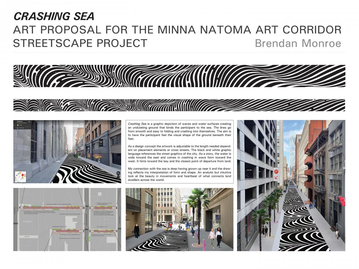
Crashing Sea is a graphic depiction of waves and water surfaces creating an undulating ground that binds the participant to the sea. The lines go from smooth and easy to folding and crashing into themselves. The aim is to have the participant feel the visual shape of the ground beneath their feet. As a design concept the artwork is adjustable to the length needed depend-ent on placement elements or cross streets. The black and white graphic language references the street graphics of the city. As a story, the water is wide toward the east and comes in crashing in wave form toward the west. It hints toward the bay and the closest point of departure from land. My connection with the sea is deep having grown up near it and the draw-ing reflects my interpretation of form and shape. An analytic but intuitive look at the beauty in movements and heartbeat of what connects land dwellers across the world.

View a larger image of the proposal
 

“Exploring Together” and “Love Letters to My Home”

Kelly Ording

Minna_Natoma_Ording-Exploring.jpgThe SOMA district of San Francisco is a vibrant area; rich with culture, art and home to many San Franciscans of diverse backgrounds. It is alive with creativity, curiosity, sound and color.  It is home to many of the City’s most beloved museums and art spaces, parks and business centers.  It welcomes short-term travelers from all over the world as well as generations of San Franciscans that have arrived to start a new life.  The SOMA District has been home to the Filipino community for years.  Its community centers, restaurants and public art celebrate this unique community.  I have developed two designs for the Minna Natoma Art Corridor.  One speaks to the colorful Filipino heritage, rich with a history of exploration and courage.  Another speaks the district’s art and architectural aesthetic presence, exploring the possibilities of human creativity.

In “Exploring Together”, I set out to create a unique design that both celebrates Filipino heritage in the SOMA district and stays true to my own artwork.  Being from the Bay Area, my work has been heavily influenced by the San Francisco Bay and the Pacific Ocean.  The colors of the water as well as the boats sailing in the Bay often show up in my work.  For me, boats are a symbol of a journey, freedom and the ability to change the course of one’s life.  Similarly, boats play a major role in the traditional Filipino life.  Boats are vessels that can travel between the hundreds of islands, explore the Archipelago, and be used for fishing and recreation.  The balangay is the oldest water vessel in the Filipino Archipelago.  It is a fundamental aspect of the indigenous Filipino spirituality.  Extending beyond the practical to that of ritual, the balangay is a vessel to the spiritual realm.  It is a symbol of the Filipino diaspora and the courage to leave one’s homeland and travel abroad.  Likewise, sailboats can be seen everyday in the San Francisco Bay, a culture of sailing that dates back to the Ohlone tule boats that cruised throughout the Bay.  These commonalities are the basis for my design.  We are all traveling through life, over land and over sea, and ultimately finding a home together in San Francisco.  The boat design is uniquely my own, yet is abstract enough to represent both the balangay and the sailboat. 

In addition to the boats, this streetscape design shows the rising sun, fog, and the lunar cycle.  I wanted to include these natural forces because they tie us all together as people, the human experience determined by our surroundings.  The sun design is unabashedly “California-esque”, with its bands of yellow gradients over the blue water.   Fog is an iconic presence in San Francisco, a weather pattern experienced by all San Franciscans, even becoming part of the inspiration for SFMOMA’s newly expanded building and architecture.  The fog design in “Exploring Together” is based on Ohlone baskets and weavings, an homage to the Ohlone Nation.  The design considers the many layers of local history, it’s many people, cultures and ecologies.  Lastly, I wanted to include the phases of the moon in the design.  The lunar cycle influences the tides of the sea, making the moon a well known companion to the sailor.  At both full moon and new moon, tides are at their most drastic, caused by the combined effects of the gravitational forces exerted by the Moon and the Sun and the rotation of the Earth.  The phases of the moon in this design are depicted in colorful tones that allude to the City’s colorful mix of ethnicities, ideas, and histories.

As a pedestrian enters the streetscape, they first encounter lines of blue, a gradation in color from dark to light.  Large boats interrupt the blue lines of the water, grouped together in some areas and independent in others.  Continuing along the street, the viewer then comes across the bright yellows of the rising sun and fog pattern with its white shapes interspersed among the asphalt background.  Ultimately the viewer arrives at the colorful shapes of the lunar cycle.  Traveling between lines and shapes, the design shifts and changes, never repeating itself.  There is also a story telling aspect to this design.  It is a story about boats traveling to a far away land or boats exploring their native land, under the sun and the moon. 

This design would be created using both the thermoplastic inlay technique for the line-work and the thermoplastic overlay technique for the more solid shapes and bands of color.  I created this design to be able to utilize the most durable medium, ensuring little upkeep and a long life.  The background color of the design is a nondescript grey to suggest an asphalt street.  The complexity of the line-work, especially where the boats meet the lines of water, would create an opportunity for the thermoplastic inlay technique to really shine.  This technique shows both the artistic intention and the craft of contemporary street design, the union between design and fabrication.    

In addition to the “Exploring Together” design, I wanted to create a wholly abstract design, expressing some of the ideas I am exploring in my own work today.  SOMA is home to many of the museums and cultural centers of San Francisco and “Love Letters to My Home” is an example of the contemporary work being created in the Bay Area today.  Living and working in the Bay Area since graduating from the San Francisco Art Institute in 1999, my work is highly influenced by my home.  My choices of colors, composition and expression of line-work are all  love letters to those who came before me and the Bay Area arts community today.

My work focuses on blending organic and geometric shapes with exact lines, pairing intuitive and mathematical mark-making.  Much of my work speaks about time, reinterpreting the way in which time moves in a poetic way.  My paintings explore the marking of time, questioning how one is able to register time in a visual way.  My paintings empower the viewer, enabling them to search their own memories or experiences to create meaning.  In that sense, it becomes abstract work by not controlling what and where the image is.  I often separate my paintings between abstracted landscapes and geometric abstractions, the former being intuitive, the latter being more intentional. While one work is done in an active state, the other is done in a meditative or quiet state.  The landscapes tend to pull their palette from the natural world, while the geometric pieces give me an excuse to experiment with color often using bright, uplifting tones.  “Exploring Together” and “Love Letters to My Home” are examples of these two types of work.  While “Exploring together” uses a landscape-based work to speak about Filipino/ San Franciscan culture, “Love Letters to My Home” uses abstract geometric work to speak about joy and the creative spirit. 

“Love Letters to My Home” uses shapes made up of line-work and solid colors to create a composition that playfully bounces along the street.  Arcs and semi-circular shapes curve and pop, playing together.  Together, the entire design creates a bright, modern playground of potential.  As a pedestrian enters the streetscape, they are greeted by six solid, bright colored shapes.  Looking beyond, they see a series of shapes made up of lines and solid shapes.  The colors shift from pink and purples to bright oranges and reds, to blues, greens and yellows back to oranges and purples.  Traveling along, the pedestrian can meander along the line-work, bouncing between solid shapes and back to line-work.  The line-work and solid shapes bounce back and forth, balancing these elements.

As with “Exploring Together”, this design would be created using both the thermoplastic inlay technique for the line-work and the thermoplastic overlay technique for the solid shapes.  Keeping in mind that the thermoplastic inlay and overlay techniques are the most durable, I set out to create designs primarily using lines and solid shapes.  Again, this design has a grey background representing an asphalt street.  Because the line-work and solid shapes are balanced in the composition,  the thermoplastic inlay and overlay techniques would similarly switch back and forth, balancing both mediums. 

“Exploring Together” and “Love Letters to My Home” were created to the dimensions of 15’ x 160’ for this proposal.  Both designs can be adjusted to any of the Minna or Natoma blocks between Second and Third Streets. 

Thank you very much for this opportunity to create designs for the Minna Natoma Art Corridor Streetscape Project.

View an image of "Exploring Together"

View an image of "Love Letters to My Home"


For a Grounded Community

Muzae Sesay

Sesay_Minna Natoma Art Streetscape_1.PNG.PNG
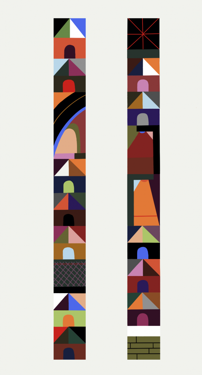
A row of multicolored houses act as a mantra for grounding and solidifying the value of a diverse community. The work becomes a wish, a prayer, a calling out, a manifestation for health, access to shelter, love, and prosperity for communities that resemble a sample of the human planet. Like the theory of the benefits of diversity in biology, genetics, and science as a whole, “For a Grounded Community” shares a similar importance for societal variety through a simple and charming design motif. It’s a strong belief that the coming together of differences, whether through ideology, culture, expression, skin color, or otherwise, provides a form of tolerance and understanding that can positively affect all aspects of a communities quality of life. This work is also a calling out for the physical housing needs as a paramount issue towards the health and stability of these diverse spaces. A reminder that it’s time for all of us to put these ideas onto the metaphorical pavement to start to produce equity for all that we value in a society. 

View an image of Muzae Sesay's Streetscape design 1

View an image of Muzae Sesay's Streetscape design 2


Untitled

Barbara Stauffacher Solomon

minna design board_BSS.jpg
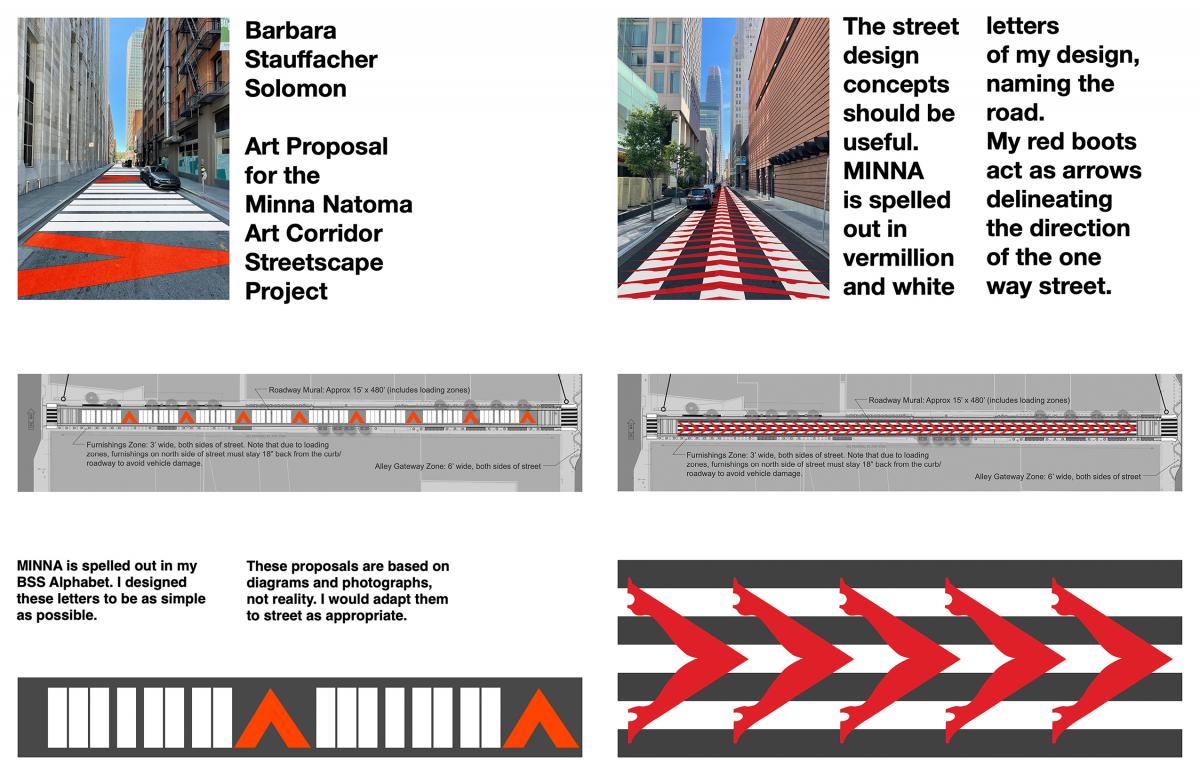
Growing up in the city in the 1930’s, Minna Street was around the corner from my father’s law office. The story always went that the alley was named after Minna Rae Simpson, a notorious resident of San Francisco during the rambunctious 1870’s. Nicknamed “The Little Countess” by Emperor Norton, Minna was a child prostitute celebrated enough at her task that it seemed plausible for a street to be named after her. Now of course we recognize how much tragedy must have accompanied her life but at the time she was regarded as an heroic entrepreneuse, plying her trade to the likes of Mark Twain and J.M. Barrie (the latter supposedly modeled the character of Wendy in Peter Pan after her.)

Minna Street runs through an area rife with history involving such women's work. In his October in the Railroad Earth, Kerouac talked about being propositioned at 3rd and Howard in the “best bar in the world” and it wasn’t much of a special occasion. Before it became an annex to the financial district, SoMA was a place for day laborers and the immigrant working class to rest and recreate by whatever means were available to them.

I’ve been around for a lot of the changes to the neighborhood and the misguided civic attempts to “clean it up.” I’ve even had a hand in those attempts, working on the Market Street renovation of the 1970’s (the current street signage is a remnant of that project which I designed while working with Lawrence Halprin.) What people seem to just now be coming around to is that the existing character (and characters) of a neighborhood can’t be overlooked when planning for the future. To have any sense of place, the true and messy past has to be accounted for and commemorated. We’re well past the stage of SoMA being a working class or predominantly immigrant community but by recognizing the dignity of its roots we can give guidance to other neighborhoods; don’t wish away the things that make your home unique, they might just become history.

Now what about the red boots? I worked as a dancer in nightclubs as a teen (two shows a night at the Copacabana for a while) and came to understand how women made money of their own in those days. Thigh highs have always symbolized this kind of empowerment for me, even becoming the lively main characters of my fourth book, READ ANY GOOD BOOTS LATELY? I’ve turned these boots into directional arrows, marching down the road for Minna Rae and all the other girls who took to the streets to take care of themselves.  The alternate proposal utilizes my newly designed BSS Alphabet to repeat Minna’s name down the length of the street. I’ve always enjoyed pushing text (through scale and form) until the way it looks begins to influence what it means. In this instance my minimalist alphabet begins to resemble crosswalks and becomes a giant message hidden in plain sight when viewed at ground level.  Either design (or a combination of the two) will need to be adapted to the real world conditions of the street, but that’s a consideration for a further point of the process.

View a larger image of the proposal


Untitled

assume vivid astro focus

avaf4SFMinna-Natoma_SM.jpgVeritably we could state that the main focus in our projects is not really to create art objects; our    prime goal is to create energy. Color has always played an essential role in our works and is one of our tools to disseminate energy. We have used color as a universal language, as a     communication device to awe and engage the public. And beyond: we use color (and scale) to fully envelop the viewer in order to make them/her/him “one” with the installation. We also use color as a conduit – of energy for sure but also of experiences and ideas. For us color functions   as a unifying force: between people and between people and space/architecture. Color brings people together and is inclusive, not exclusive. Besides energizing the viewer, our intention is  also to energize architecture. Color as an all-encompassing tool.

Our objective is for our work to be music-like. For us music is the perfect artistic medium whereby it reaches the viewer and transmits ideas. The way it does so is very corporeal and entices an immediate and shareable reaction, using our  bodies as an instrument for its  manifestation. The abstract and spontaneous - but still conscious - absorption/understanding of  music—it is ethereal, it is energy and it is not an object—is universal and a huge influence in our projects.

In connection to these ideas above it has always been important for us to refer to avaf as a “collective”. Not a collective in the strict sense of the word (the very same group of artists regularly working together) but a collective of like-minded friends/people who would sometimes join forces. In that regard, “collectivity” is for us an inclusive mindset in which anyone could potentially be part of. Including the viewer.

The viewer has always been centerpiece in all avaf exhibitions. Our installations are invariably spaces of freedom, equality, and diversity. Self-expression, pleasure, and joie de vivre are all elements we generally emphasize and stimulate in our projects. avaf interrogates intolerance, and exclusivism and encourages generosity and participation through conceptual frameworks rooted in the politics of freedom of expression, civil rights, and gender identity.

We’ve always wished our audience was broader and more varied. The traditional art world environment is very elitist, exclusivist and often detached of social contexts. It’s also a contrived space where there are implicit behavioral rules. There is an inherent “classism” that has always bothered us. Spontaneity has always been a goal for us and you fully achieve that when you to go to the public sphere. You reach people who are not necessarily expecting to be reached and that causes a spontaneous sincere reaction.

The public sphere brings an otherworldly but yet truthful character to the unexpected. And at same time you need to transmit confidence to people to guarantee their participation, engagement and deliverance. The viewer in a public context doesn’t necessarily know who you are, where you come from, what you usually do, and nevertheless they are there bringing your piece to life. The power of unexpected trust.

Our public projects embody the ultimate sense of the word “Gesamtkunstwerk” (“total work of art”): unrestricted by the limitations of an art gallery/museum, we are able, in the public sphere, to reach a wider audience, often a viewer we wouldn’t reach in an art environment. Our beliefs in color’s communication and healing properties come to life when implemented in a public context. The partnership with local representative communities is fundamental for any public project to happen fully guaranteeing opportunities for civic participation and empowerment.

Having all these thoughts and aspirations in mind we wanted to propose a streetscape for the Minna Natoma art corridor that would for sure draw inspiration from the Filipinx neighborhood context but also have a universal reach. An artwork that would embrace the local community and pay tribute to its values and dreams.

 The very first element that captivated us was the golden-yellow sun symbol featured in the Philippine national flag - a ubiquitous emblem for warmth, radiance, positivity and life. We decided to make it center piece and have all other elements in the design emanate from it.

The other core inspiration in our proposal were the jeepneys – ultra colorful buses that are the most popular (and affordable) means of transportation in the Philippines (and unfortunately at increased risk of being phased out permanently). Always extravagantly adorned, they are a distinct symbol of the country’s culture and art and also a reflection of the Filipino spirit –   resilient, innovative and optimistic. Clearly using color as a communication tool to attract and please its customers we immediately made a connection between the jeepneys and our own imagery.

Our proposal for Minna Natoma corridor incorporates various elements and embellishments  from existing jeepneys. Since people will be physically walking over this artwork our intention is to offer a very dynamic explosion of references and colors that will not only light up the viewer’s body but could also function like a flying magic carpet ready to transport us to a new vivid Bayanihan communal existence.

This proposal should be most likely executed as Thermoplastic Overlay. As you can see we have   not restricted the color palette but could edit it according to the product limitations and the existing roadway markings.

View an image of Eli Sudbrack's proposal

Banig, Hablon, The Sun

Mel Vera Cruz

MEL VERA CRUZ_Small.jpg
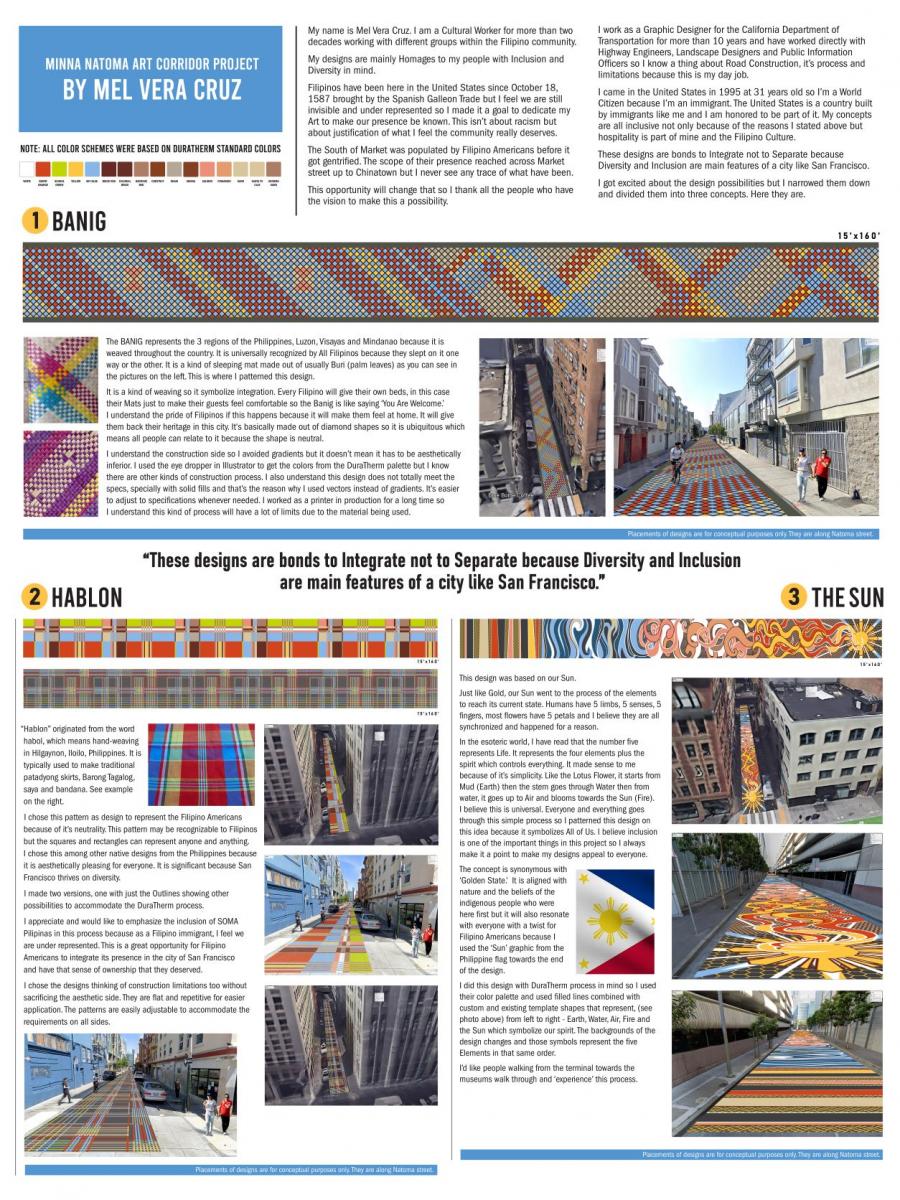
My name is Mel Vera Cruz. I am a Cultural Worker for more than two decades working with different groups within the Filipino community. 

My designs are mainly Homages to my people with Inclusion and Diversity in mind. 

Filipinos have been here in the United States since October 18, 1587 brought by the Spanish Galleon Trade but I feel we are still invisible and underrepresented so I made it a goal to dedicate my Art to make our presence be known. This isn’t about racism but about justification of what I feel the community really deserves. 

The South of Market was populated by Filipino Americans before it got gentrified. The scope of their presence reached across Market street up to Chinatown, but I never see any trace of what have been. 

This opportunity will change that, so I thank all the people who have the vision to make this a possibility.

I work as a Graphic Designer for the California Department of Transportation for more than 10 years and have worked directly with Highway Engineers, Landscape Designers and Public Information Officers so I know a thing about Road Construction, it’s process and limitations because this is my day job.

I came in the United States in 1995 at 31 years old so I’m a World Citizen because I’m an immigrant. The United States is a country built by immigrants like me and I am honored to be part of it. My concepts are all inclusive not only because of the reasons I stated above but hospitality is part of mine and the Filipino Culture. 

These designs are bonds to Integrate not to Separate because Diversity and Inclusion are main features of a city like San Francisco. 

I got excited about the design possibilities, but I narrowed them down and divided them into three concepts. Here they are.

1. The BANIG represents the 3 regions of the Philippines, Luzon, Visayas and Mindanao because it is weaved throughout the country. It is universally recognized by All Filipinos because they slept on it one way or the other. It is a kind of sleeping mat made out of usually Buri (palm leaves) as you can see in the pictures on the left. This is where I patterned this design. 

It is a kind of weaving, so it symbolizes integration. Every Filipino will give their own beds, in this case their Mats just to make their guests feel comfortable so the Banig is like saying ‘You Are Welcome.’ I understand the pride of Filipinos if this happens because it will make them feel at home. It will give them back their heritage in this city. It is basically made out of diamond shapes so it is ubiquitous which means all people can relate to it because the shape is neutral.

I understand the construction side, so I avoided gradients, but it doesn’t mean it has to be aesthetically inferior. I used the eye dropper in Illustrator to get the colors from the DuraTherm palette, but I know there are other kinds of construction process. I also understand this design does not totally meet the specs, especially with solid fills and that’s the reason why I used vectors instead of gradients. It’s easier to adjust to specifications whenever needed. I worked as a printer in production for a long time so I understand this kind of process will have a lot of limits due to the material being used.

2. “Hablon” originated from the word habol, which means hand-weaving in Hilgaynon, Iloilo, Philippines. It is typically used to make traditional patadyong skirts, Barong Tagalog, saya and bandana. See example on the right.

I chose this pattern as design to represent the Filipino Americans because of its neutrality. This pattern may be recognizable to Filipinos, but the squares and rectangles can represent anyone and anything. I chose this among other native designs from the Philippines because it is aesthetically pleasing for everyone. It is significant because San Francisco thrives on diversity. 

I made two versions, one with just the Outlines showing other possibilities to accommodate the DuraTherm process.

I appreciate and would like to emphasize the inclusion of SOMA Pilipinas in this process because as a Filipino immigrant, I feel we are underrepresented. This is a great opportunity for Filipino Americans to integrate its presence in the city of San Francisco and have that sense of ownership that they deserved.

I chose the designs thinking of construction limitations too without sacrificing the aesthetic side. They are flat and repetitive for easier application. The patterns are easily adjustable to accommodate the requirements on all sides

3. This design was based on our Sun. 

Just like Gold, our Sun went to the process of the elements to reach its current state. Humans have 5 limbs, 5 senses, 5 fingers, most flowers have 5 petals and I believe they are all synchronized and happened for a reason. 

In the esoteric world, I have read that the number five represents Life. It represents the four elements plus the spirit which controls everything. It made sense to me because of its simplicity. Like the Lotus Flower, it starts from Mud (Earth) then the stem goes through Water then from water, it goes up to Air and blooms towards the Sun (Fire). I believe this is universal. Everyone and everything goes through this simple process, so I patterned this design on this idea because it symbolizes All of Us. I believe inclusion is one of the important things in this project, so I always make it a point to make my designs appeal to everyone.

The concept is synonymous with ‘Golden State.’  It is aligned with nature and the beliefs of the indigenous people who were here first but it will also resonate with everyone with a twist for Filipino Americans because I used the ‘Sun’ graphic from the Philippine flag towards the end of the design.

I did this design with DuraTherm process in mind so I used their color palette and used filled lines combined with custom and existing template shapes that represent, (see photo above) from left to right - Earth, Water, Air, Fire and the Sun which symbolize our spirit. The backgrounds of the design changes and those symbols represent the five Elements in that same order.

I’d like people walking from the terminal towards the museums walk through and ‘experience’ this process.

View Mel Vera Cruz's proposal

Opportunity For Public Comment

Please take a few minutes to review these artwork proposals to provide public comment. Public comments will be considered as part of the Final Review Panel meeting where the Panel members will recommend two proposal for implementation. The proposals are available online at www.sfartscommission.org/calendar, in the Public Art Proposal Display section or comments may be emailed to sfacpublicartcomment@sfgov.org by Wednesday, August 9th, 2021 at 5:00 p.m.

The Final Review Panel meeting will take place virtually on Thursday, August 12, 2021, 2:00 p.m. – 6:00 p.m. and will be open to the public to attend. An agenda for the meeting will be posted 72 hours in advance on SFAC’s website under the Public Meeting section: www.sfartscommission.org along with instructions on how to join the meeting virtually. Please note that public comments do not constitute a vote.

What's Coming Up

Public Meeting

Executive Committee Meeting

December 18
/
1:00 PM to 2:30 PM

Hybrid: 401 Van Ness | Rm 125 and Online
Public Meeting

Visual Arts Committee Meeting

December 16
/
2:30 PM to 6:00 PM

Hybrid: City Hall | Rm 408 and Online
Public Meeting

Community Investments Committee Meeting

December 09
/
1:00 PM to 3:00 PM

Hybrid: City Hall | Rm 416 and Online
Public Meeting

Full Arts Commission Meeting

May 06
/
2:00 PM to 4:00 PM

Hybrid: City Hall | Rm 416 and Online